Cómo elegir una impresión fine art para tu espacio
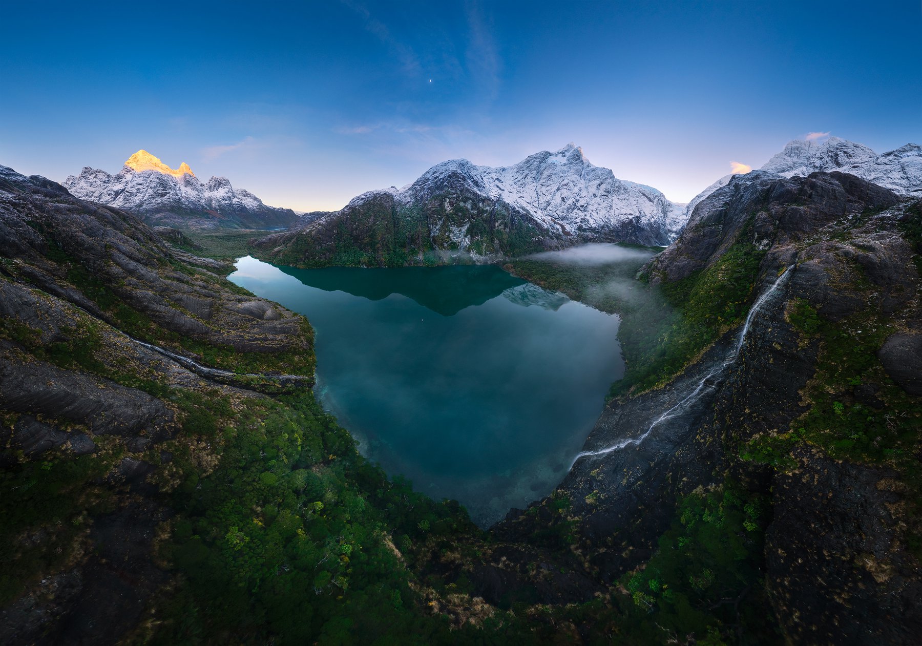
Para elegir bien una impresión fine art, parte por el tamaño en relación con la distancia desde la que se va a mirar, sigue con el papel según la luz del espacio y termina por la orientación y el montaje. En ese orden. La mayoría de las decepciones con una obra impresa no vienen de la fotografía, sino de haber elegido un tamaño que no conversa con la pared. Esta guía es el mismo criterio que uso cuando alguien me escribe para llevar una obra a su casa u oficina.
1. El tamaño se decide por la distancia, no por la pared
La regla que mejor funciona es sencilla: la distancia cómoda de visionado ronda 1,5 a 2 veces la diagonal de la obra. Una impresión cuya diagonal mide 100 cm se disfruta plenamente desde 1,5 a 2 metros. Si la vas a colgar en un pasillo estrecho donde nunca te alejas más de un metro, una obra enorme te obliga a mirarla por partes; si la pones al fondo de un living amplio, una obra pequeña desaparece.
Un segundo criterio, para obra sobre un mueble (sofá, aparador, cabecera), es que la pieza ocupe entre dos tercios y tres cuartos del ancho del mueble. Se ve intencional y equilibrado. Antes de decidir, marca el rectángulo en la pared con cinta de papel y vívelo un par de días: es gratis y evita el error más caro.
2. La orientación de la obra debe seguir a la pared
Una pared ancha y baja pide obra horizontal o un díptico; un muro alto entre dos ventanas pide vertical. Mis paisajes de Patagonia suelen ser panorámicos y respiran mejor en horizontal sobre un sofá; una toma vertical de bosque andino ordena un rincón estrecho. Si dudas, la orientación de la fotografía casi siempre te dice dónde quiere estar.
3. El papel se elige según la luz del espacio
Este es el paso que casi nadie considera y el que más cambia el resultado. Un espacio con mucha luz natural o focos directos favorece un papel de algodón mate tipo museo: no refleja, y deja leer la obra desde cualquier ángulo. Un ambiente más controlado, donde quieras profundidad y negros densos, luce increíble en papel luster. Y una obra pensada para sentirse pictórica, casi textil, funciona en canvas. Desarrollo cada opción en la guía de papeles fotográficos.
En una frase
- Pared con reflejos o luz dura → algodón mate.
- Ambiente controlado, buscas contraste y detalle → luster.
- Quieres una textura pictórica, sin vidrio → canvas.
4. Montaje: con o sin marco, con o sin vidrio
El montaje protege y encuadra. Un marco con paspartú (el margen blanco entre la obra y el marco) da aire y una lectura de galería; el vidrio o acrílico protege el papel mate de roces y polvo. El canvas suele ir montado en bastidor y prescinde de vidrio, lo que aligera visualmente la pieza. No hay una opción correcta: hay una coherente con el resto del espacio. Si el lugar ya tiene mucha madera y textil, un montaje limpio y sobrio equilibra; si es minimalista, un marco fino desaparece y deja mandar a la fotografía.
5. Qué significa "edición limitada" y por qué importa
Cada obra que vendo es de edición limitada y numerada: existe un número máximo fijo de copias y, una vez agotada esa edición para un tamaño, no se imprime nunca más. Las piezas de la colección principal son ediciones de 10 y las de la colección premium, ediciones de 5. Esto no es un truco de marketing: es lo que separa una decoración de una obra de colección, y lo que sostiene su valor en el tiempo. Cada impresión sale firmada y con su certificado.
Cómo llevar una obra a tu espacio
Puedes ver las obras disponibles en la tienda. Dos buenos puntos de partida son Niebla Lunar y Amanecer en el Llaima, ambas de la Araucanía andina. Acepto Mercado Pago, transferencia y PayPal para clientes internacionales, y despacho a todo Chile y al extranjero. Si tienes una pared específica en mente y quieres que te oriente con el tamaño y el papel, escríbeme: prefiero que la obra funcione de verdad en tu espacio antes que cerrar una venta.
Y si lo tuyo es aprender a hacer tus propias imágenes de este nivel, mis talleres y expediciones son el camino directo a fotografiar —y luego imprimir— tus propios paisajes.
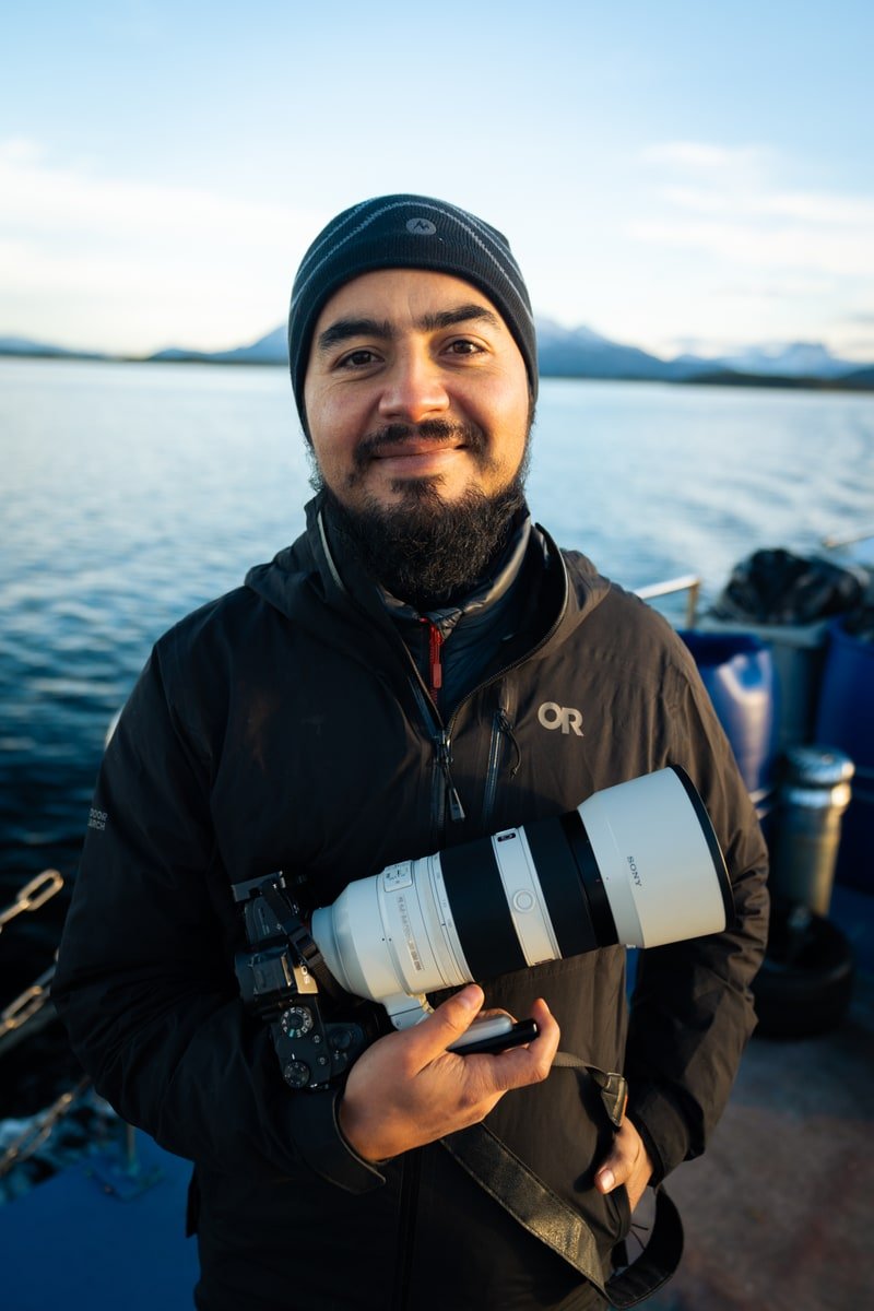
Rodrigo Viveros
Fotógrafo fine art de paisaje y naturaleza, Chile. Sobre mí